Best Business Card Designs
The best business card designs are the ones that not only address aesthetics, but also have optimum functionality. When I first started my jewelry business I had a keen sense of design and had no problem designing an attractive business card.
Twenty four years later I still like the first card I ever designed, however soon after I designed them I learned what the inherent problems where.
I quickly learned that the best business card designs where not solely to do with artistic ability. Beyond visual appeal, this little three and half by two inch real estate had to keep telling my potential customer my story once that card left my hands.
Sometimes what you leave out is just as important as what you include. In my case my first mistake was not including a product image. I did include a sweet little black and white drawing of a pair of vintage boots that I proudly sketched out myself.
Although I loved the little drawing I knew that, while they did convey the period style of my work, probably most people thought that I designed shoes and not jewelry.
The second thing I learned is that I did not want to include a fax number on my card and this lesson came after I started to receive an increasing amount of junk faxes. Perhaps this does not pose as much of an issue today as advertising spam comes more in the form of email.
So, what makes the best business card designs and how do we balance beauty and function? Let's start by looking at what not to do. Some of the business card mistakes I am going to cover are not applicable to certain professions and these "do not do" tips are really intended only for visual artists : )
Best Business Card Designs...
10 Business Card
Mistakes to Avoid
No Image - If you are a visual artist and you are not including an image you are increasing the chances that either your potential customer will not remember how passionately moved they where by your work or they just plain won't remember where they got the card and what it is for.
Having an excellent image that is representative of your best work is one of the most effective ways to get a potential customer to keep your card. Images are compelling and people are less likely to consider ditching your card.
The best business card designs include a good image that will evoke an instant recall when that customer is in need of a present or an item for themselves.
Not Enough Info - Leaving out vital information is like passing up free advertising. Make sure that you cover all bases on your card and include what you are selling, where to find your products and how to contact you. Make sure to include your online presence such as website and social media.
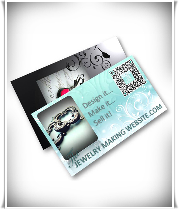
The best business card designs include function and since customers cannot actually click on any icons for social media addresses on a card consider adding real function with a QR code that will quickly and easily lead them to your Facebook page.
Too Much Information - You want to leave some clean space on your card for people to digest the information that is important. Choose your information wisely and don't over crowd your card with all sorts of images and text that cause confusion. The best business card designs incorporate some white space.
If you have extra information remember that you have all this great space on the back of your card where you can put a tagline or QR codes for social media or your website sign up page. Leave some white space to rest the weary eyes : )
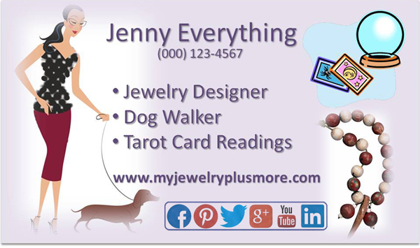
If you are creating multiple streams of income by writing books or dog walking to supplement your craft show income don't include those on the same card. Rule is one card per product and one card per profession unless they closely integrate.
If you are a healer and you make healing jewelry you can easily incorporate both into the same card... this is called wholistic. If you make jewelry and you sell Amway they belong on separate cards... this is viewed as "I am not sure what i want" even if you are clear on your goals.
Contact Information - Now this is an area that some people will likely disagree with my opinion. I do not like to include a fax number or an email address on my cards. I only include two vital pieces of information: a telephone number and a website address. (I am specifically talking about business cards for artists and especially those who exhibit at shows.)
I learned early in the game that whenever I exhibited at a show people would come to my booth and ask "do you have a card?" Funny enough they did not spend any time looking at what I had to sell and they seemed to have quite a collection of cards.
It became evident that craft shows were a great venue for all sorts of service and product companies to make contact with small business owners.
In a short time i received all sorts of faxes for products such as windows, loans, insurance... you name it. When email became the main form of communication then the offers started to come in that way.
I am not saying don't invite others to fax or email you, I am only suggesting that you screen your contacts by letting them go through the proper channels. They visit your website or Etsy shop and they fill out the form to contact you. This way you reduce the spam that comes your way.
The one exception to this rule is for wholesale. When I am exhibiting at a wholesale show I include my fax and email in my literature and catalogues because I want to make it as easy as possible for customers to place an order.
Font Confusion - The best business card designs will only include one or a maximum of two font styles within a design. Choose fonts that are easy to read and avoid script fonts that are too fancy.
Make your type big enough for those with less than perfect vision to read without having to get out a magnifying glass to hold in front of their reading glasses. No, really, I am serious here. There have been times when i needed check the dosage on medicine for my kids and I could not even read the label with my glasses. I had to put my glasses on and then hold a magnifying glass up to the label!
Make the font size easy to read and be careful with light colours or clashing colours. Some people can look at fine striped t-shirts and others cannot. Our eyes just jump around and we cannot bear to look. The same goes for crazy colour combinations.
Edit - Check your work then have someone else check for grammar and spelling before it goes to print. This goes for the placement and size of your text and images as well. Try printing it out in actual size and you can better see if the text is too small or large or whether the spacing between text blocks and images needs to be adjusted. Leave a little gutter space for printing. Whoever you decide to print with will specify how much that space should be.
If you change any of your pertinent information it is time to design a new card. Crossing out the old number and writing in the new makes for a sloppy card and lessens the effect of what you are trying to achieve.
Odd Size - The standard size business card is three and a half by two inches
and it is that way for a reason. This compact size fits into a wallet, a purse slot and a pocket just like a credit card. This convenience makes it more likely that your interested party will keep the card longer : )
Backside - It will not cost you much more to print on the back of your business cards. As mentioned earlier this is a great space to add more information such as what your company stands for or your social media information.
Quality - Your work is a beautiful extension of you so make your card that way too! The quality of your card speaks your self worth, not only to your customers, but to you as well. When someone holds your card it should equal the quality of your work so make sure that you choose premium card stock, a reputable printing company and ensure your images are saved at 300 dpi.
Brand - Here is where I preach "do as I say and not as I do." The truth is that I do not exactly follow the rule of having my business card match my website. I have way to much fun experimenting with business card design. While I do follow the same classic style, my business card tends to match my show booth more than my website.
At my booth i have printed banners in black with white flourishes and images of my jewelry. It is deep and dramatic because I feel it grounds the space and attracts customers and the cards i hand out match that look. I like my website to be light and airy. I am not recommending that you change up your style because it is always better to keep your branding the same across the board.
If you are just starting out you have the advantage of creating a design that you will use on your cards, your website, your packaging and your show signage. Having a clear image helps with the continuity of customer experience and emanates the air of professionalism. Strong branding says that you are well established and speaks a message that is uniquely yours.
I hope this list will help you to avoid common business card mistakes. Feel free to leave a comment below and share your tips on the best business card designs : )
New! Comments
Have your say about what you just read! Leave me a comment in the box below.